
A website is essential for improving conversions and building solid relationships with customers.
But what should a website for a B2B company look like?
At a time when online sales are growing significantly, with an expected increase of 18.9% from 2024 to 2030 (source: Grand View Research), it would be a serious strategic mistake not to invest in
- Technology such as AI
- Digital infrastructure such as the website
- Online marketing with lead generation and sales campaigns.
Technology and technical skill together should go into a solid, well-structured digital presence, so that companies stay competitive in a faster, increasingly digital market.
Which brings us to building an optimised website for your company, one that attracts users and turns them into new customers.
Let's look at what to consider on structure, content and design (and more) to build a site that makes selling easier and improves the company's image.
In the second part of this article we will also look at B2B website examples to take inspiration from.
What is a B2B website?
A B2B website is an online platform designed and built specifically to sell goods and services to other businesses.
Unlike a traditional brochure site, it has a specialised interface built to make the buying process easier, with detailed information, featured offers, technical specifications and, of course, a direct contact form to open a line of communication with sales representatives.
The core idea behind a B2B website is to have a tool that works 24 hours a day to promote your company's services and products.
B2B ecommerce is growing fast. In the past, online selling was seen as something for consumer sales only. Today, business-to-business relationships have gone digital too, and where the service or product does not need in-depth consultation, it can be sold through an online store, as Alibaba does.
Company website: B2B vs B2C
B2B and B2C differ in several ways:
- target audience: in B2B several decision makers are involved in the purchase, while B2C usually involves a single customer.
- buying process: in B2B the decision is more complex, so the sales cycle is longer.
- customer relationships: B2B focuses on long-term relationships, so building trust with customers matters. B2C often focuses on the immediate sale.
- type of content: B2B buyers look for in-depth content such as case studies, reports and technical information. B2C focuses on the benefits of products or services and gives more weight to emotional content.
We covered these differences in more depth by looking at how sales and marketing strategies differ in B2B and B2C.
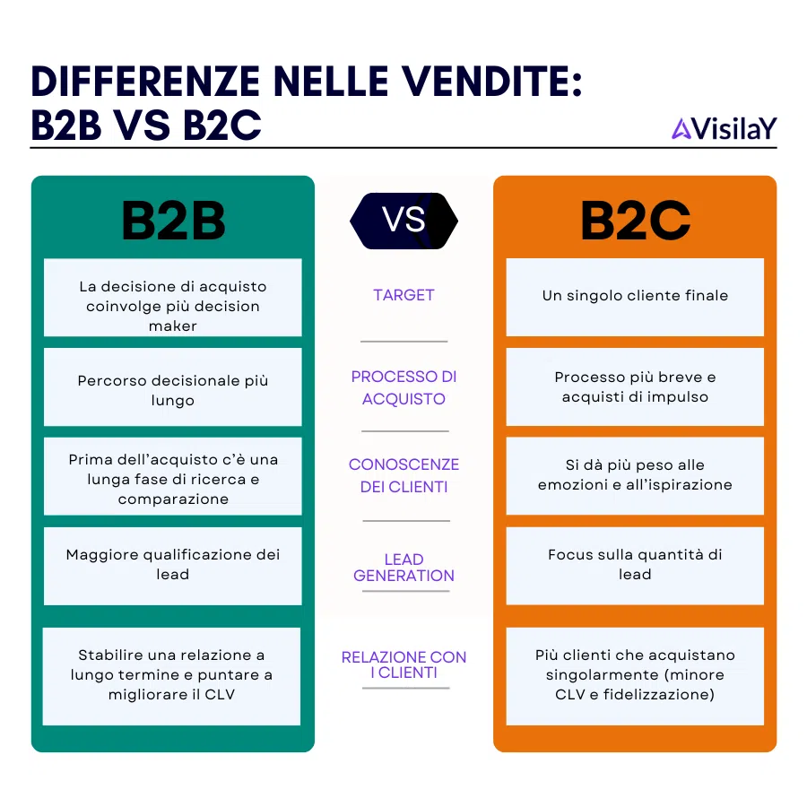
Given how different the two areas are, it follows that the goals of a B2B website differ from those of a B2C one.
Among the goals of a B2B company website, focus in particular on:
- building a solid system for generating new leads, for example by using lead generation tools and integrating them into the website;
- showing authority so you can build a long-term relationship of trust with customers. Content marketing helps here, for example through case studies and white papers;
- improving brand awareness, partly through communication and design that are consistent with the brand;
- supporting the sales process, for example by sharing information sheets, catalogues, FAQs and guides that help before the sale.
These are some of the ways a well-structured website can make a real difference to sales. Now let's move on to the key points for building a B2B website.
Building a B2B website in 7 steps
Building a website means considering several aspects, from design and structure to features. On a site focused on B2B sales, pay particular attention to:
- website structure: how the site and its pages are organised, plus the landing pages that can sit on the same domain but stay separate from the site itself.
- content: you can build a content marketing strategy that uses the website as its distribution channel, for example to attract organic traffic. You can also host resources on the site to use as lead magnets for new leads.
- design and features: the look of the site, its features and its integrations with other systems such as CRMs all need thinking about while the site is being built.
- performance and security: a website must work well and also have strong security and performance (in terms of loading times).
- visitor engagement: all the features that put us in touch with visitors and turn them into leads (contact forms, live chat and support hubs).
- analytics: tracking user behaviour helps us improve the site.
- Efficient customer support: chatbots, FAQs and instant support improve the user experience.
Website structure
Before you start building a site, you need to think about its structure.
Think of the website structure as the foundations of a house: you have to start from the base. Like foundations, the site structure must be well designed from the outset, because changing it later can be costly and complicated. You can always extend the initial structure by adding pages and resources, but having a clear plan from the start makes the difference.
The basic structure of a B2B website usually contains the pages listed in this table.
| Page | Purpose of the page | Sub-pages |
|---|---|---|
| Home | The landing page for most visitors. It needs a well-structured menu leading to the main pages. It briefly introduces the company and its services or products. | ❌ |
| About us | This page expands on what the home page mentions to describe the company. | The About us page can link to more specific resources such as: - a page introducing the team; - company history; - mission and values. |
| Services / Products | An overview page of the services or products on offer. | Individual product or service pages usually link from the main one. (Depending on the type and complexity of the business, there may be several pages per service type, each with sub-pages for individual services.) |
| Case studies / Portfolio | Brings together case studies and recent work. It is key to showing authority in your sector. | Individual pages focused on each case study can link from the main page. |
| Resources | Can be built as a hub pointing to several types of content: for example reports, ebooks and courses. | Each resource usually has its own page. Here too there can be several sections: for example one page listing all the white papers, with a dedicated page for each white paper. |
| Contact | The contact page can hold contact details and, in some cases, a form. | ❌ |
Of course, the site does not need all these sections from day one. You might want to add a resources section with reports, or a blog with industry insights, only later, once you have produced enough content.
What matters when you first build the website is to set up the structure so the elements that will make it up are already in place. That also makes later additions and changes easier.
Bear in mind that these pages form the "basic structure" of the site. On top of them, you should also consider dedicated landing pages for individual services or products.
Landing pages are used, for example, to receive traffic from ad campaigns. Unlike the other pages on the site, they take a different approach: navigation elements (such as the menu) are removed, because at this point you do not want the visitor to explore the site but to take an action. A landing page usually has one purpose, which can be:
- a purchase;
- starting a demo;
- filling in a lead generation form.
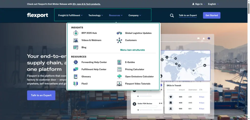
Within the site structure, another key element is the navigation menu. It must include all the important pages while staying lean enough to reflect the site hierarchy.
Flexport, for example, has only four main items in its menu, but its submenus give access to the most important pages. In this example I have highlighted how the Resources category in turn links to the different types of resources on the site, such as the blog, the glossary and the help centre. Here the resources are further split into Insights and Resources.
Content
In B2B, content is created to bring in traffic through an SEO strategy and to generate leads. Content also strengthens brand authority by showing knowledge of your sector.
The most common content types include:
- reports
- webinars
- videos
- case studies
- industry research and studies
- ebooks
- white papers
- blog posts
- podcasts.
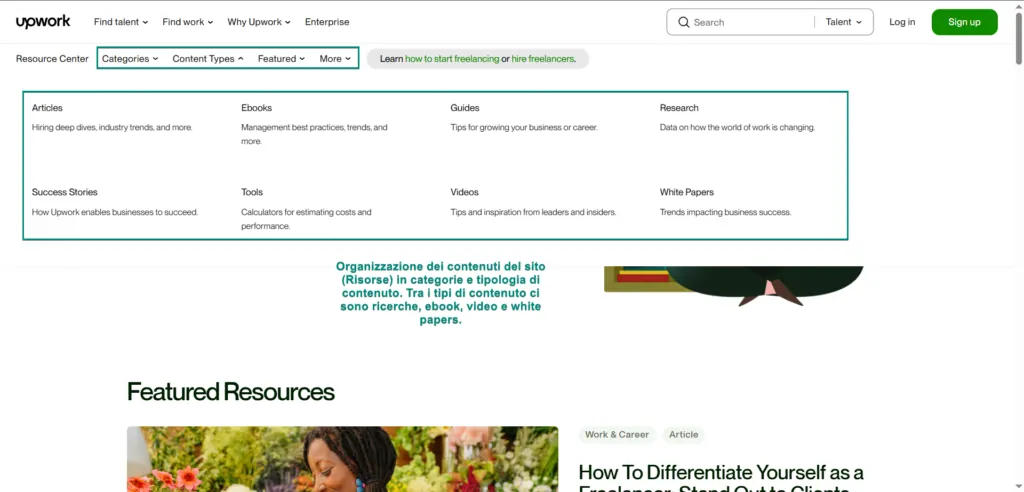
A good example is Upwork's Resource center: a proper hub where you can search content by category or by type. Content types include:
- articles
- success stories (testimonials)
- ebooks
- guides
- research
- tools
- videos
- white papers.
When choosing a content type, you also need to think about the channel it will be distributed through. According to research by the Content Marketing Institute, the blog section of the website is the second most used channel (84%), just behind social media (89%). So the website is widely used to distribute content.
Design and features
A B2B website should be designed to look professional and modern and to work well. Elements such as pop-ups, banners and live chat can be very useful to announce an offer or news, or to put visitors in touch more quickly. When you design them, though, they have to fit properly into the site structure so that they:
- do not get in the way of reading;
- do not clash with other elements of the site and make them unusable.
It gets more complicated when you consider that the site must be accessible and work perfectly on every device. So designing a site and adding features means finding the right balance between features, eye-catching design and usability.
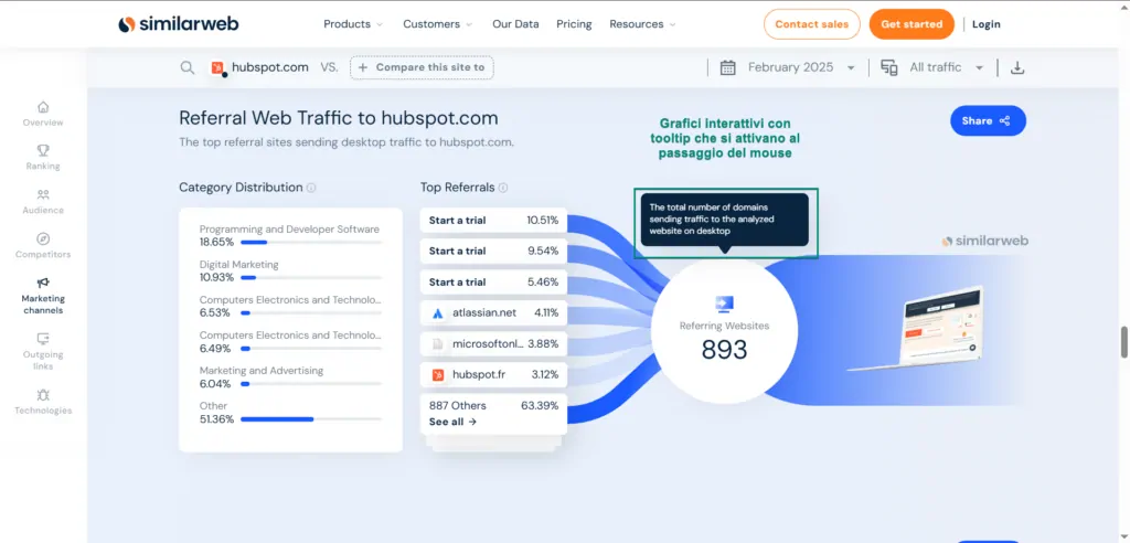
Similarweb, for example, shows interactive charts in its reports with tooltips that appear on mouse hover. This feature is used on the desktop version of the site, but not when you visit on a mobile device.
Optimise performance and security
Website speed matters for several reasons:
- site performance is assessed by search engines and affects rankings. See Google's Core Web Vitals, three main metrics (LCP, INP and CLS) covering loading speed and page usability, looking at how the page behaves as it loads.
- speed affects the user experience. A slow site can have a higher bounce rate: if a page takes more than 2.5 seconds to load, people may leave (SEJ). A faster site, on the other hand, can convert better.
To measure the speed of a site (and of individual pages), you can use tools such as:
- Google PageSpeed Insights;
- GTmetrix;
- Pingdom;
- WebPageTest.
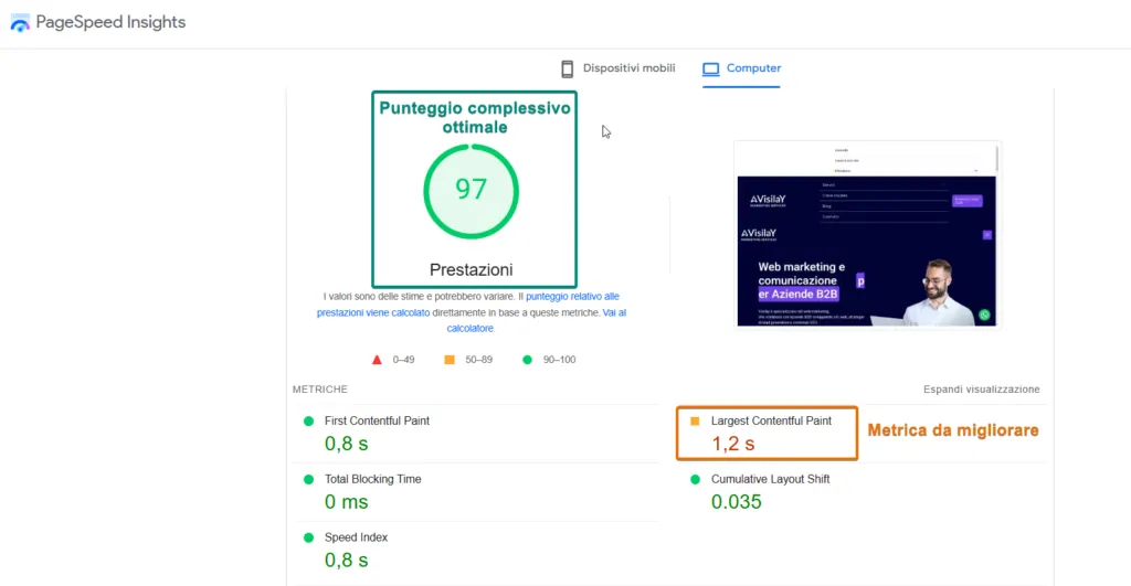
Security matters as much as speed. There are several steps you can take to make a site more secure:
- choose secure hosting that provides security tools (SSL certificate, firewall and antivirus);
- keep the software you use up to date;
- adopt a disaster recovery system (simple automatic backups may not be enough, and extra systems with multiple backups are sometimes needed);
- strengthen authentication with extra measures such as 2FA;
- review access rights regularly, applying the principle of least privilege.
Visitor engagement
One of the main goals of a B2B website can be lead generation. Collecting the details of people who are genuinely interested in your business is what lets you start talking to them more directly. When building a website, plan it around your lead generation strategy and encourage people to leave their contact details or get in touch with the sales team.
You can do this with several tools:
- adding a form to the contact page or the home page;
- adding a live chat widget or a direct link to your WhatsApp Business account;
- sharing your contact details, such as phone number or email;
- adding FAQs or a live bot to the site to answer the most common questions.
Analytics
When you build a website, design the whole site from the outset to get the most out of it. In particular, the website is a valuable source of data on user behaviour.
With analytics tools such as Google Analytics, and heatmaps from tools such as Clarity, you can analyse user behaviour: for example, the clicks made and the pages visited. This information is essential for improving the site and its usability, and for spotting problems that stop people navigating properly.
Tools such as VWO (Visual Website Optimizer) also help you structure and improve the website through A/B testing. The aim is to work out how to improve usability or conversions by testing alternative versions of the same page and measuring the changes. Analytics tools like these are just as essential for B2B ecommerce.
B2B website examples
Now that we have covered the key points for building a B2B website, let's look at some real sites. For each one we will highlight some strengths, based on what we have discussed so far about:
- usability;
- site structure;
- types of content to focus on;
- contact methods.
ClickUp
ClickUp's home page gives an immediate overview of the tool. At the top there is a very clear CTA (in the brand colours) inviting you to sign up.
The navigation menu is very well structured: the "Product" item is split into use cases (project management, development, resource management), all features and integrations (the latter essential for the tool to talk to other tools). Each menu item also highlights quick links to:
- the contact page;
- the product demo;
- the app download link.
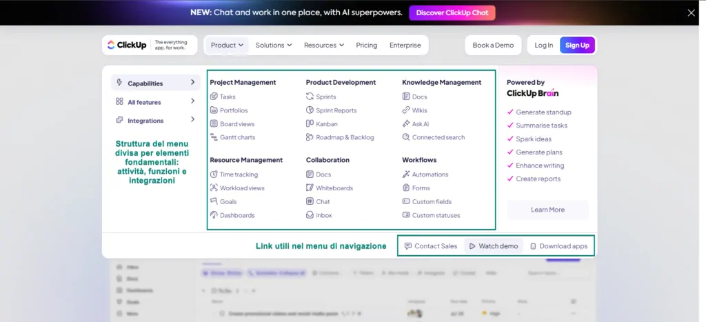
The site puts a lot of emphasis on use cases: the Team section gives access to use cases split by company type, department (e.g. marketing or sales) and use case (project management, remote work).
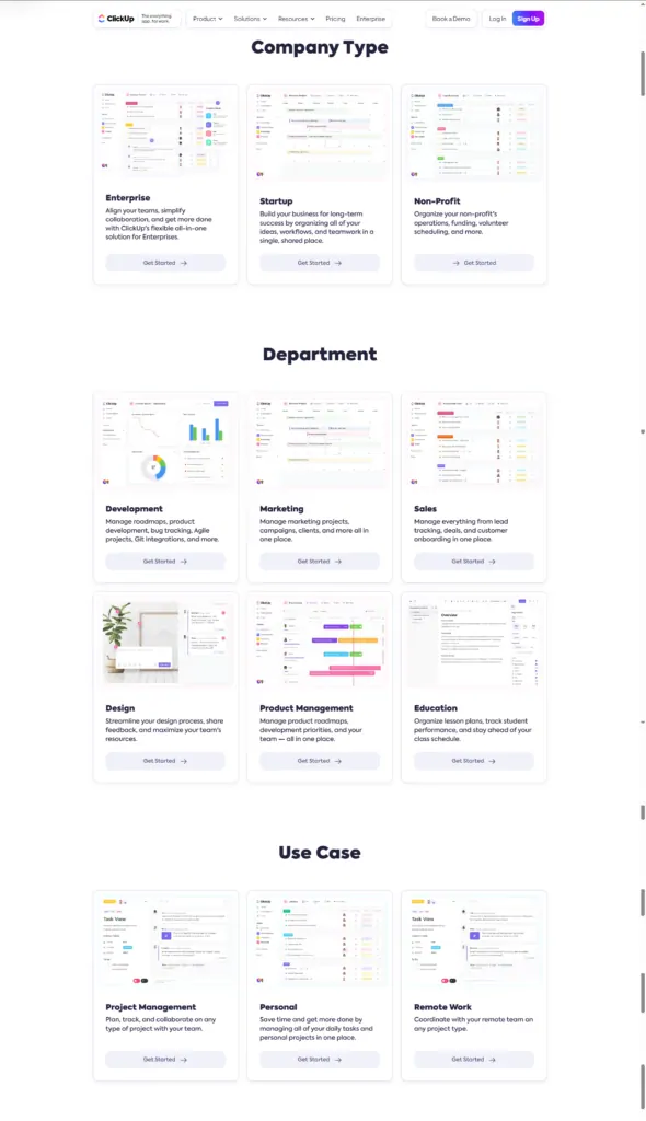
Each of these sections leads to a separate page designed to meet different needs. If you select "Personal", for example, the page highlights features more suited to a personal plan, while "Project management" focuses on creating views, automations and other features that save time when managing projects and working in structured teams.
ClickUp's Contact section is a full hub that works as a help centre. The page first invites you to look for your problem among the available resources, using the search bar or suggestions based on the most frequent searches.
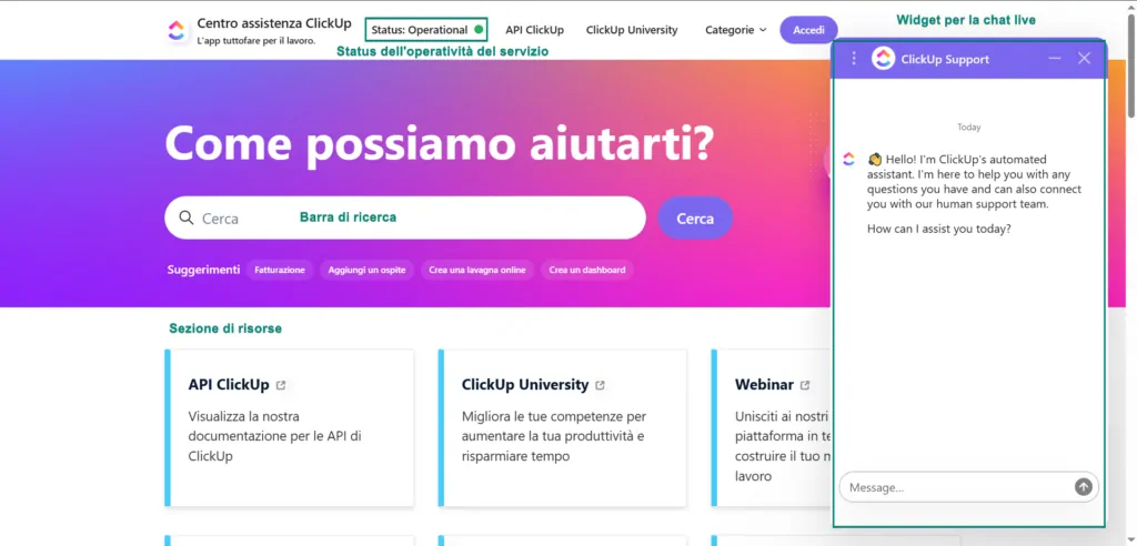
Further down the page there are useful resources organised by category and accordion FAQs collecting the most viewed resources. Only at the bottom of the page are you invited to get in touch, although you can also use the widget in the bottom right, which opens a live chat with a bot that can then put you through to an agent.
ActiveCampaign
ActiveCampaign's home page puts the form for starting a free trial front and centre. The focus is on getting visitors to start the free trial.
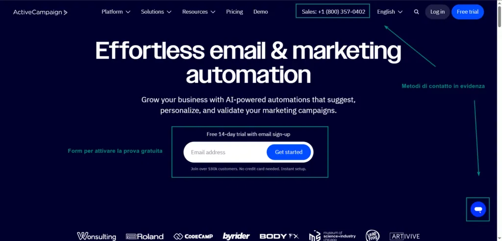
Contact methods are also given prominence:
- the top menu shows the phone number for the sales team;
- in the bottom right you can open a live chat with a help bot that answers the most common questions.
ActiveCampaign's contact page is split into two sections:
- one for people who already have an account (to get in touch, start training or browse the support centre);
- the other for everyone else. Here different channels are highlighted: phone calls or requests to the team, and a form to request a demo.
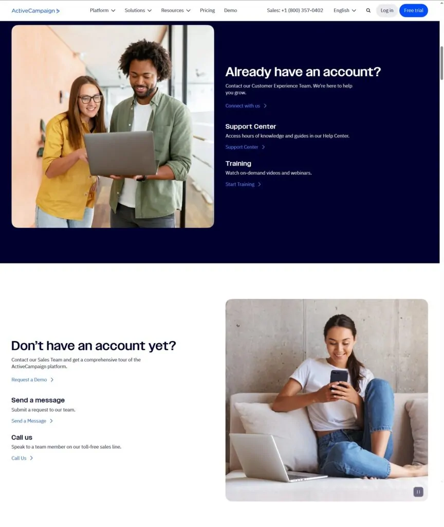
So rather than offering one quick way to get in touch, the focus here is on routing users to the most suitable type of support.
HubSpot
Staying with contact options, HubSpot takes a different approach from the ActiveCampaign example we just saw. HubSpot's contact page clearly highlights three contact methods: phone, chat and demo request.
Scrolling down, you can go straight into the live chat, which sits in the middle of the page instead of in a widget in the bottom right. Further down is the form to request a demo.
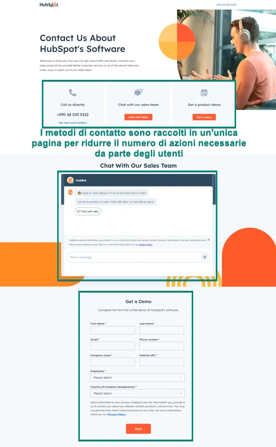
Here the priority is making first contact with visitors straight away. This approach puts every contact method on the same page and does not require any further steps to reach the chat or the demo request form.
Hootsuite
Hootsuite has an overall resources section bringing together several content categories. You can browse by category or industry, or see the latest resources.
Content types include:
- research
- strategies
- case studies
- toolkits.
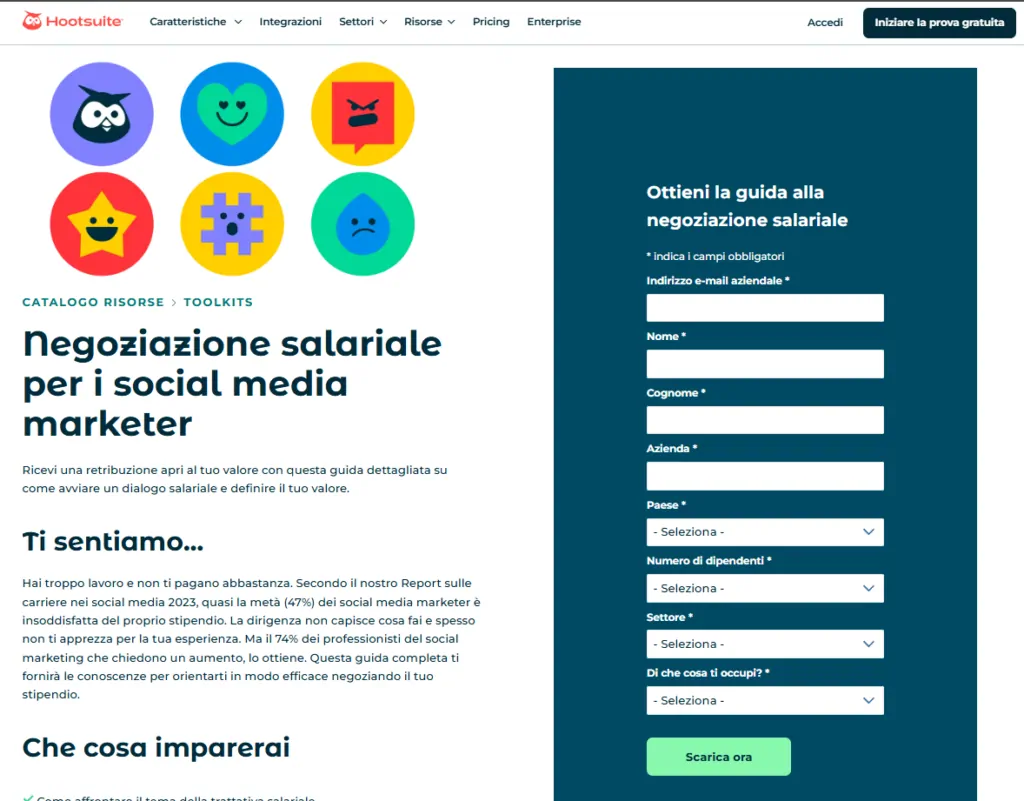
Hootsuite is a good example of using resources for lead generation. Some resources are freely accessible, while for others you have to leave your contact details to download the guide, as in the example below.
Intel
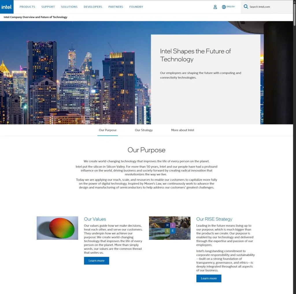
Intel has a Company Overview page that presents the company's mission and strategy, then links to dedicated pages covering its values in more depth.
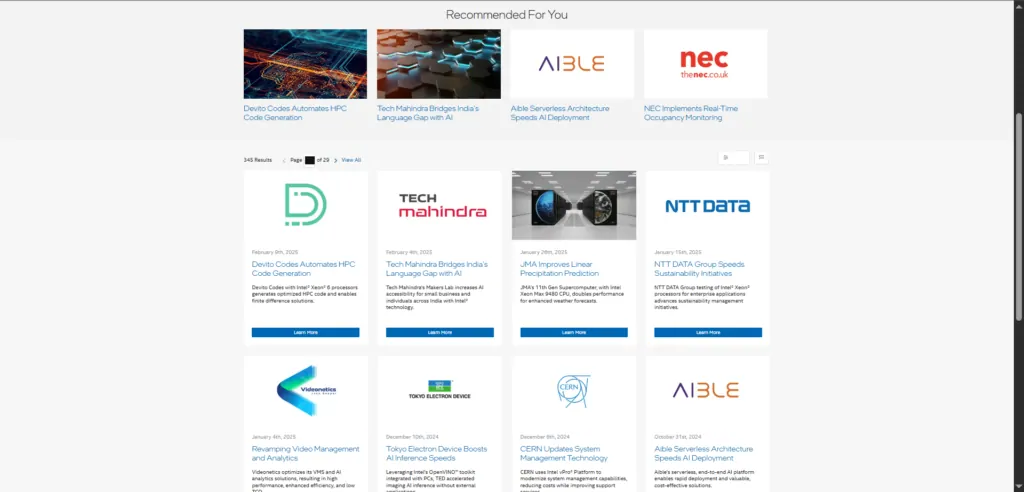
The case study section is also worth a look: as well as the full archive of published case studies, it features a selection of highlighted ones.
Build a high-performing B2B website with Visilay
A B2B website must reflect the company's image, but it cannot be treated as a simple shop window. The goal of a site is to attract new visitors, engage them and let you get in touch with leads.
To do that, the site has to meet several criteria. As we have seen, both structure and design need care, along with technical optimisation and analytics. At Visilay we can help with the design and development of your website and with maintenance and support to keep the site up to date and secure. Get in touch to start improving your online presence and your conversions.
